![]()
![]()
|
Tomonari Kamba
Shawn A. Elson
Terry Harpold
Tim Stamper
Piyawadee "Noi" Sukaviriya
The small physical size of a PDA limits the maximum size of its screen, which can be no larger than the dimensions of the machine in which it is embedded. On the other hand, the need for displayed text to be legible defines another, more subtle boundary: if the size of text cannot be reduced below a threshold of legibility, then, as the screen shrinks in size, and less information may be shown on it, and the user will be required to increase the level of interaction with the device in order to get to desired information.
The design of user interfaces for PDAs must balance two opposing forces: the need to shrink the screen to a size that fits inside a very small box (we'll call this the "physical" limitation), and the need to keep the screen sufficiently large to show enough information that the device is actually useful (we'll call this the "functional" limitation.) This balance becomes particularly difficult in the case of navigational or functional controls, the widgets that must somehow be made available to the user to allow interaction with the information on-screen (switching between tasks, selecting information to be changed in some way, adding new information, etc.). Most of the interface objects used in desktop computing environments - pull-down or popup menus, multiple windows, icons - consume a great deal of valuable screen space on the PDA screen. This accounts, we believe, for the efforts of the designers of the current crop of PDAs to minimize the size of these interface objects, or, in some cases, to eschew them altogether. It explains also the emphasis that many of these systems place on handwriting recognition technologies - the keyboard is perhaps the most cumbersome of control widgets. (The document-oriented, pen- and gesture-driven elements of the Newton interface are a good example of these approaches.)
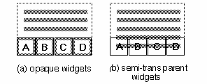
Once again, however, the interface designer faces a version of the functional limitation: the user will expect not only to passively read content displayed on the device, but also to do something with it (to select it, modify it, or enter new content, etc.), and this means that he or she will need to interact with objects (widgets) that are different from the text, but equally available. These widgets must be large enough to be readily distinguished from the content and from each other, and to be practical targets for some kind of interaction (by means of a finger or pen, for example.) But if they are displayed all or most of the time, they will consume screen space that could otherwise be used to display content. Because the number of these widgets will depend on the functions supported by the active application, and not on the size of the screen, the portion of screen that must be surrendered to them will increase as the screen grows smaller, as illustrated in Figure 1.

Our research focused on techniques for reducing the screen space that must be surrendered to widgets, thereby maximizing the available space for display of content. In the next section, we will review general solutions to this problem suggested by the work of other researchers and designers working with interfaces of both handheld devices and desktop computers. Among these solutions, we will single out one approach that seems especially promising to us: the use of semi-transparent widgets, laid over text, so that both are present on the screen at the same time, but the text is able to fill nearly the entire screen. We will, however, point out a serious limitation with this solution, related to user interaction with the text. In the remaining sections of the paper, we will propose a variation of the semi-transparent widget/text model that improves its responsiveness to user interaction, and describe the results of a series of usability studies of a prototype that applies this improved model.
Pad++ applies another kind of zooming/panning technique to displayed content [2]. The user can focus on and zoom into any part of the content, and smooth animation during the zoom insures that the semantic link between the zoomed information and its context are maintained. Galaxy of News [12] uses similar zooming techniques combined with dynamic restructuring of data hierarchies during the zooming/panning process.
We feel that these methods suggest several improvements on the simple, scrolling displays of long lists or blocks of text that are commonly encountered when using PDAs. However, they suffer from a critical limitation: filtering information content so that it may be displayed in smaller chunks that require less screen space does not obviate the need for widgets required to apply the filters, or to enable manipulation of the filtered content.
Gestural interfaces, like that used in Apple's Newton operating system, mark an important departure from the paradigm of on-screen control objects. Tying functionality to pen-based gestures frees up valuable screen space, because the user can directly interact with displayed content by simply drawing over it with the pen. This technique works well in many applications, but it also has limitations. First, the user must learn the gestures, and be able to reproduce them accurately. (The list of gestures on the inside of the screen covers of the Newton MessagePad 110 and 120 suggests that users are unlikely to be able to recall all the possible gestures without a mnemonic aid.) Second, not all functions supported by current PDAs can be mapped to intuitive gestures. There is a row of unchanging iconic buttons below the active screen space of the MessagePads. These buttons are used to switch between applications, and to undo previous tasks. By moving these buttons out of the active screen space, Apple has reclaimed area for displaying information, but in so doing has also underscored the difficulty of the problem illustrated in Figure 1.
Kurtenbach and Buxton's Marking Menus [7] offer an interesting variation on the gestural interface. In their system, when the user holds a pen to the screen for a predefined period of time, a pie-shaped menu is displayed below the pen, and the user can select an item in the menu by stroking toward it. Users who are familiar with the structure of the menu can select menu items without waiting for the pie to be displayed, by simply stroking in the direction of that slice of the pie. This approach appears to combine strengths of a gestural interface and a menu- or icon-driven interface, as it hides widgets until they are needed, and allows the content to fill the entire screen. For these reasons, Marking Menus may be a good solution for reclaiming space on small screens. It does not, however, permit simultaneous display of widgets and content. Because the pie menu is opaque, it will at least temporarily obscure underlying content.
We believe that the use of control widgets of variable transparency is a promising method for maximizing usable screen space. If the transparency of widgets is adjusted so that the content with which they intersect on-screen is nonetheless legible, then it should be possible to display both the widgets and a full screen of content without sacrificing any screen space reserved for the latter. There is, however, a serious obstacle that must be overcome before this method will support user interaction with the content.
For the purposes of our argument, let us assume that the widget layer is on top of the content layer. If opaque widgets obscure otherwise selectable content, and no mechanism is provided for passing through the widget layer to the content, then the user will be able to interact with only those parts of the content which are not obscured. If, however, the widget layer is semi-transparent, that is, if the underlying content and the widgets are legible at the same time, then it is not immediately clear which of the two layers is selectable (for copying, editing, etc.), even if there is no formal mechanism for selecting the bottom layer. This is illustrated in Figure 2.
Instead, we propose a technique for determining the layer receiving user interaction that does not require an additional modifying step, as it based upon variations in the duration of the interaction. In this variation on the transparent widget/ content model, the length of time during which the user engages with a region of the physical screen (wherein widgets and content overlap) would determine which virtual layer of the screen receives the interaction.
The prototype was implemented on a Macintosh in Allegiant SuperCard. Although the mouse-driven interface of the Macintosh differs from the pen-based interfaces of many PDAs, we believed that using a desktop computer for initial evaluation would nonetheless generate valuable data. Though we have emphasized in this paper the importance of the issue of screen size for PDAs, the balancing of window size with maximum content display in small windows is of value on desktop computers, where multiple windows may be open at any one time, and the user may wish to reduce the size of any given window to a practical minimum, while still being able to display as much content as possible. Interaction techniques developed for small screens would in this case apply equally well to larger screens displaying many small windows. Moreover, this initial run of the experiment was designed to test the merits of varying the responsiveness of semi-transparent objects (widgets and text), and those kinds of objects need not exist only on PDAs.

Most of the icons, and all of the hypertext links were only partially functional - when the user successfully highlighted a link or icon, a status message was briefly displayed in a floating palette on the screen. (This palette is not shown in Figure 3.)
The layered icons and text at the bottom of the screen - comprising nearly 20% of the total screen space - were of variable translucency. As the icon layer was made more translucent, the text layer became more opaque, and vice-versa. After a small series of pilot tests, we decided to fix the translucency settings at 80% opacity for the text, and 20% for the icons, to insure good legibility of both icons and text. As we were principally interested in recording the test subjects' reactions to changes in the responsiveness of links and icons, we did not allow the subjects to change the transparency settings, nor did we run the test at other transparency levels.
Sixteen volunteer subjects were selected from among the faculty, graduate students and staff of the Graphics, Visualization and Usability Center, and the School of Literature, Communication and Culture of the Georgia Institute of Technology. Most of the subjects were expert users of the Macintosh or another mouse-driven graphical user interface. Most were familiar with hypertext concepts. Fewer than half had any experience with PDAs.
After a brief training session with the prototype to demonstrate
the functions of the semi-transparent icons and the delayed
response behavior of the software, each subject was asked to
perform eight tasks:
Each subject repeated the eight tasks six times: three times with the prototype configured to favor link selection (that is, to initially highlight the link when the mouse was clicked where a link and an icon overlapped, as if the link were on top of the icon), and three times with the prototype configured to favor icon selection. In both selection methods, if the mousebutton were held down for longer than a predefined period of time, the click would appear to pass through the object on top, highlighting the object under it. The association between response delays and layers was rigorously enforced: if selection of links was favored, the subject was required to hold down the mousebutton for the stipulated period of time before any icon would be selected, even if the icon did not overlap with any links.
We further divided the link-first and icon-first selection groups according to the response delay that determined the switching between layers. Each subject attempted all eight tasks for each method of selection with preset delays of 2/5 second and 4/5 second. In the third set of tasks for each selection method, the subjects were allowed to adjust the response delay, between a range of 1/5 of a second and a full second. The sequence in which the subjects performed the series of tasks was shuffled to compensate for learning effects.
At the conclusion of the experiment, each subject was given a brief questionnaire that reviewed the test, and included questions asking which of the selection methods was preferred (links first or icons first), and which switching delay (between 1/5 and 1 second) was preferred for each method.

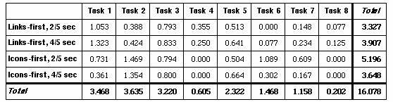

Our experiment with a prototype for an online newspaper that uses this selection technique bears out this assumption, and raises additional questions. After an initial learning period, the test subjects were able to select underlying screen objects, regardless of whether those objects were text or icons. Subjects did, however, have greater difficulty successfully selecting objects of one kind when the other kind of object was on the top layer. Our results suggest that it may be easier for subjects to use a variant of the semi-transparency/delayed response model, in which the delay in responsiveness does not apply to objects in one layer which do not appear to intersect with objects in the other layer.
Nothing in our experiment calls into question the merits of techniques for maximizing usable screen space that rely on alternative views of information content. Indeed, it should be possible to combine this semi-transparency/delayed response model with content-based methods for reclaiming space on small screens.
2. Benderson, B., Hollan, J., Pad++: A Zooming Graphical Interface for Exploring Alternate Interface Physics, UIST'94, pp. 17-26, 1994.
3. Bier, E., Stone, M., Pier, K., Buxton, W., DeRose, T., Toolglass and Magic Lenses: The See-through Interface. SIGGRAPH'93 Conference Proceedings, pp. 73-80, 1993.
4. Card, S., Robertson, G., Mackinlay, J., The Information Visualizer, an Information Workspace, CHI'91 Proceedings, pp. 181-88, 1991.
5. Harrison, B. L., Ishii, H., Vicente, K. J., Buxton, W., Transparent Layered User Interfaces: An Evaluation of a Display Design to Enhance Focused and Divided Attention, CHI'95 Proceedings, 1995.
6. Jog, N., Shneiderman, B., Interactive Smooth Zooming in a Starfield Information Visualizer, University of Maryland Technical Reports, CS-TR-3286, 1994.
7. Kurtenbach, G., Buxton, W., User Learning and Performance with Marking Menus. CHI'94 Proceedings, pp. 258-64, 1994.
8. Lamping, J., Rao, R., Piroli, P., A Focus+Context Technique Based on Hyperbolic Geometry for Visualizing Large Hierarchies, CHI'95 Proceedings, 1995.
9. Lieberman H., Powers of Ten Thousand: Navigating in Large Information Spaces, UIST'94 Proceedings, pp. 15-16, 1994
10. Mackinlay, J., Robertson, G., Card, S., The Perspective Wall: Detail and Context Smoothly Integrated, CHI'91 Proceedings, pp. 173-79, 1991.
11. Rao, R., Card, S. K., The Table Lens: Merging Graphical and Symbolic Representations in an Interactive Focus+Context Visualization for Tabular Information, CHI'94 Proceedings, pp. 318-322, 1994.
12. Rennison, E., Galaxy of News, UIST'94 Proceedings, pp. 3-12, 1994.
13. Robertson, G. G., Mackinlay, J. D., The Document Lens, UIST'93 Proceedings, 1993.
Using small screen space more efficiently / tomo@cc.gatech.edu