![]()
![]()
|
| Beverly L. Harrison | Kim J. Vicente | |
|---|---|---|
| Dept. of Industrial Engineering and | Alias|Wavefront | Dept. of Industrial Engineering |
| University of Toronto | 110 Richmond Street East | University of Toronto |
| Toronto, Ontario, Canada | Toronto, Ontario, Canada | Toronto, Ontario, Canada |
| M5S 3G9 | M5C 1P1 | M5S 3G9 |
| beverly@dgp.utoronto.ca | benfica@ie.utoronto.ca |
50% transparent, regular Motif style menu, solid background
100% transparent, AI font style menu, wire frame background
FIGURE 1. Experimental Sample Images. (Image resolution degraded due to
scaling.
Actual screen images were of much higher quality and resolution.)
The associated psychological problem we are addressing is that of focused and divided attention. When there are multiple sources of information we must make choices about what to attend to and when. At times, we need to focus our attention exclusively on a single item without interference from other items. At other times, we may need to time share or divide our attention between two (or more) items of interest. In this case, we rapidly switch attention back and forth between the items (necessitating minimal "switching costs"). There is a trade-off between these attentional requirements.
Transparency is perhaps most useful in achieving better integration between task space and tool space, between multiple tools, or between multiple views. Many applications are designed with a large work space or data area which is the primary focus of attention, while the tools to manipulate the data appear in windows and palettes over top of the work area. These tools divert or block our attention from our work, which is often providing feedback about the actions we apply, for example, painting or drawing systems and the traditional UI tools to change paint brushes and colors. However, there are several examples of highly-advanced systems which exemplify more seamless task-tool integration through the application of transparent user interfaces. In Heads Up Display (HUD) design, aircraft instrumentation (a graphical computer interface) is superimposed on the external real world scene, using specially engineered windshields [12]. In the ClearBoard work [7], a large drawing surface is overlayed on a video image of the user's collaborative partner. The TeamWorkStation system [6], predecessor to ClearBoard, created semi-transparent computer work space windows superimposed with video image windows (e.g., a person, an object being discussed). The ToolGlass and MagicLens work [1, 2, 10] reflects a tight coupling between tool function, target object specification, and transparency. Other designs include such things as video overlays like those used in presenting sports scores in broadcast television.
Some designs combine transparency and 3-D projected views of the user interface. Several examples are: the work on "3-D silk (volume) cursors" [13], the work by Knowlton [8], which used graphical overlays projected down onto half-silvered mirrors over blank keyboard keys to dynamically re-label buttons and functions keys (e.g., for telephone operators), and the work by Schmandt [9], who built a system to allow users to manually manipulate and interact with objects in a 3-D computer space using a 3-D wand. Again a half-silvered mirror was used to project the computer space over the user's hand(s) and the input device. Disney has also developed a product called the "ImaginEasel" for animators and artists. ImaginEasel keeps the user's hand and input device in the workspace (using mirrors). In every case transparency provided a more seamless integration between the data or work and the UI tools.
The study described in this paper represents an "applied" experiment to evaluate transparency and text menu item selection, but it is intended to inform us about transparency and text legibility in general. Text labels are either selectable in themselves (e.g., as menu items, hypertext links) or they are important cues in differentiating and identifying graphical window items for subsequent selection (e.g., button labels, data entry fields). Also we wish to apply transparency to help systems and on-line documentation. Clearly the effect of transparency on overall text legibility is a critical consideration in these situations.
Significant main effects were found for transparency level, word type, and color (all p<.001). Transparency increases resulted in performance improvements in word naming, since the word was more legible (Graph 1). There was a significant interaction between transparency and color F(12, 163)=6.17, p <.0001, suggesting that word legibility is affected not only by level of transparency (i.e., visibility) but also by the properties of the color used (i.e., saturation and luminance). Post-hoc analysis showed 3 significantly different groupings of transparency levels: 5%, 10%, 100%+50%+20%+0%. Most illegible trials occured at 5%; above 10%, subjects made virtually no errors.
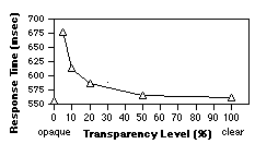
Graph 1. Mean Response Time Results from the Stroop Experiment - Word Naming
(Background) Task.
(Invert X axis to reflect foreground menu task
relevant to text selection experiment.)
The analysis of the Icon Palette Experiment data [5] revealed several points relevant to our Text Legibility Experiment. The type of icon, type of background, and transparency level were all statistically significant (p<.0001), as were the interactions between these factors. Graphs 2 and 3 summarize some of these interactions. Briefly, solid icons and solid image backgrounds are significantly more interference resistant than line art or text, resulting in the best performance. Line art icons and text icons perform equivalently, as do wire frame backgrounds and text page backgrounds. There is no significant performance degradation between 0% (opaque) and 50% transparent.

GRAPH 2. Mean Response Times - Icon Type
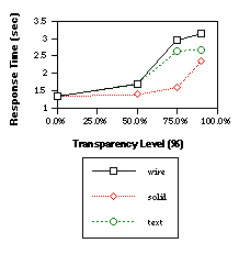
GRAPH 3. Mean Response Times - Bkgrnd Types
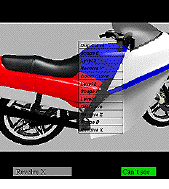
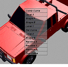
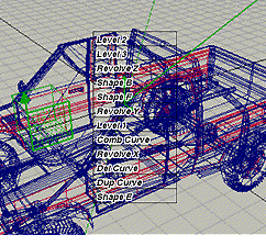
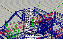
FIGURE 2. Sample Trial Screen showing target item.
 |  |
| 3 (a) labels & surface around | 3 (b) labels are opaque, |
| labels are both transparent | surface around labels is transparent |
FIGURE 3. Comparison of design alternatives for transparent text items.
(Image
resolution degraded due to scaling.) Actual screen images were much higher
quality.)
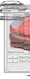
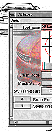
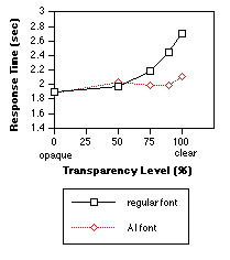
When applying the Anti-Interference (AI) fonts, we anticipate more interference-resistant images than regular font text (Figure 4). This would give us a flatter curve which is shifted towards better performance. (This is not unlike the effect shown in Graph 2 and 3 when the complexity of the image was simplified, for example, from text to solid).
4 (a) Regular fonts, 100% transparent, wire bkgrnd
4 (b) AI fonts,100% transparent, wire bkgrnd
H2: Increased complexity or information density on the background will make text legibility decrease. Text backgrounds will have the worst performance, followed by wire-frame, then solid images.
H3: AI fonts will significantly improve performance by creating more interference resistant text.
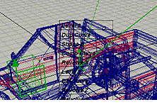
We used 2 groups of text items within the menu: each group was visually similar to ensure true legibility performance. The menu items were: Revolve X, Revolve Y, Revolve Z, and Dup Curve, Comb Curve, Del Curve. Six other menu items were randomly distributed with the target items. (A 12 item menu was felt to be representative of the average menu/menu size used within the actual product.) Items were randomly assigned positions within the menu for each trial. This was done to ensure the experiment was not confounded by subjects learning the position of items. (We were interested in testing true text legibility rather than menu usability. Randomly ordered menus will produce worst case data which overestimate performance degradation, versus standard menu usage. This gives us a conservative range of transparency levels.) The target item was presented to the subject throughout the trial as a reminder. This was to prevent memory errors (which were not pertinent to the goals of this study).
We randomly assigned background images of three types: text pages, wire frame images, and solid images. Three samples of each type were created. Images were 8-bit color rendered images. These backgrounds were aligned such that a major portion of the content was directly under the menu.
We randomly assigned the level of transparency to the menu. These levels were based on our previous experimental experience [4, 5] and test pilot results with this experiment. Levels of 0% (traditional opaque menus), 50%, 75%, 90% and 100% (clear) were used. The opaque level represented the baseline condition where the fastest performance was anticipated. Transparency levels were produced using alpha blending of the foreground and background images (as opposed to stippling or masking). A level of 75% transparent would mean that 75% of the background image was combined with 25% of the foreground image, producing the effect of a highly transparent menu.
Finally, we randomly assigned either regular font style or our AI font style to the items. Regular fonts were matched to the Motif style menus that appeared from windows on the SGI (Helvetica, 14 point, bold, italic was the best match). We developed Anti-Interference (AI) fonts as a potential interference resistant font technique (Figure 4b). Since an AI font has two opposing color components, it remains visible in any color background.
In AI fonts, the opposing outlines of the text are rendered in a color which has the maximal contrast to the color of the text. For any selected text color vector [R, G, B], our AI font algorithm calculates the luminance value Y according to the YIQ color model used in television broadcasting ([3], page 589). Note that the red, green and blue components are not equally weighted in contributing to luminance.

| condition | df | F value | p< |
|---|---|---|---|
| background type | 8, 72 | 1.06 | .01 |
| transparency level | 4, 36 | 4.12 | .0001 |
| font type | 1, 9 | 3.38 | .0001 |
| bkgrnd type X font type | 8, 72 | 1.59 | .001 |
| bkgrnd type X transp | 32,288 | 2.44 | .01 |
| bkgrnd X font X transp | 32,287 | 3.76 | .001 |
To determine if the differences are significant between the individual lines plotted within each of the graphs, a Student-Newman-Keuls (SNK) test was conducted post-hoc as a comparison of means. (This determined the clustering of items within font type, background type, and transparency level and indicated which items are not statistically different from each other.)
GRAPH 4. Mean Response Times for Transparency
Levels X Font Style (across all background types)
We also conducted a finer grained analysis at each transparency level. At 0% and 50%, there were no statistical differences between background types or between font styles. At 75%, 90%, and 100% transparency the AI font performed significantly faster than the regular font (shown in Graph 4). There are significant differences between backgrounds at these levels, though these differences are not based on the type (text, wire, solid) but rather on the individual image properties. For example, the text pages each used a different font style, one of which was purposely matched to the menu item font style. This page performed significantly slower than the other pages (Graph 5a). The denser wire frame images (i.e., more complex meshes and therefore darker in color) performed significantly slower than the simpler wire frames (Graph 5b). The solid images with black components (the truck and the camcorder), performed significantly slower than the solid multi-colored motorcycle image (Graph 5c).
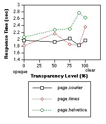
GRAPH 5a. Mean Response Times for Transparency
Levels X Page Background Types (across font types).
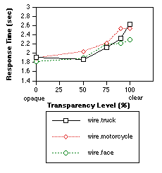
GRAPH 5b. Mean Response Times for Transparency
Levels X Wire Background Types (across font types).
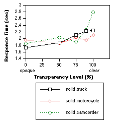
GRAPH 5c. Mean Response Times for Transparency
Levels X Solid Background Types (across font types).
The adjacency item errors are most strongly influenced by the width of the target areas. Since this was designed to match standard Motif menu widths, we did not increase the width size to reduce these errors. However, we are most interested in substitution misses, since these are partially attributed to poor visibility of the target item. These errors were surprisingly evenly distributed across transparency levels. AI fonts made little difference in reducing these errors.
At the 90% level, mostly text items over the text pages or wire frame backgrounds were illegible. At the 100% level, the two solid backgrounds with black color components accounted for 70% of the illegible trials. (The menu font was black, therefore one would expect these trials to be illegible). Surprisingly, text pages accounted for only 3% of the errors made at 100% level.
The mean response time for legibility errors was 6.84 seconds (the "threshold of frustration"), almost 3 times the response time for other trials. This implies that subjects exerted substantial effort to respond to each trial before giving up. In effect, this figure represents the "tolerance threshold" beyond which it is too much effort to locate the target.
Font type X background content interactions were most strongly affected at highly transparent levels. Performance differences are small between 0% to 50%. (This is consistent with results from our Stroop Experiment and the Icon Palette Experiment.) Surprisingly, the text backgrounds produced much better performance than expected. The most critical dimension of interference with text menu selection tasks was color conflict. The closer in shade and hue the background is to the text color, the higher the interference and the worse the resulting performance.
Both this experiment and the Icon Palette Experiment assume priority is given to selecting items from the foreground and hence they measured this selection criterion only. Clearly to round out the research we need to measure the level of awareness the subjects preserve of the background content. In particular, how are background focused attention tasks affected by transparency? To this end, we have just completed a study which tests selection accuracy of features from background images while icon palettes and text menus are superimposed, varying the level of transparency of the palettes and menus. We believe that this latest experiment, which uses the same stimuli and methodology, provides us with a comparable background task. This measure of background visibility is particularly relevant for tasks like the ToolGlass work [1, 2, 10] or click-through tools which require alignment of the palette item with a specific background object or area.
While this paper presented results for using text superimposed over a variety of background images, this methodology can be generalized to other types of interfaces by incorporating images or backgrounds from any target application or working product. The idea is to capture realistic screens at a single moment in time. With these captured images, any sort of menu, window, or palette can be superimposed at varying transparency levels and tested. Using this approach, performance can be predicted and the most appropriate settings can be determined for a variety of target applications. These empirical results can be combined with subjective assessments to provide strong insights about the most and least preferred design solutions in a generalized way. Our long-term goal is in providing user interfaces which improve the fluency of work by more seamlessly integrating the tools with the task space.
2. Bier, E. A., Stone, M. C., Fishkin, K., Buxton, W., and Baudel, T. A Taxonomy of See-Through Tools Proc. of CHI'94, Boston, Mass. 1994, 358-364.
3. Foley, J.D., van Dam, A., Feiner, S.K., and Hughes, J.F. Computer Graphics - Principles and Practice (2nd ed), Reading, Mass.: Addison-Wesley, 1992.
4. Harrison, B. L., Ishii, H., Vicente, K. J., Buxton, B. Transparent Layered User Interfaces: An Evaluation of a Display Design Space to Enhance Focused and Divided Attention. Proc. of CHI'95, Denver, Colorado. 1995. 317-324.
5. Harrison, B. L., Kurtenbach, G., and Vicente, K. J. An Experimental Evaluation of Transparent User Interface Tools and Information Content. Proc. of UIST'95, November, 1995, 81-90.
6. Ishii, H. and Kobayashi, M. Clearboard: A seamless medium for shared drawing and conversation with eye contact. Proc. of CHI'91, Monterey, CA, 1991. 525-532.
7. Ishii, H. TeamWorkStation: Toward a Seamless Shared Workspace. Proc.of CSCW'90 L.A., CA, 1990. 13-26
8. Knowlton, K. C. Computer displays optically superimposed on input devices. Bell System Technical Journal, Vol. 56, No. 3, March, 1977. 367-383.
9. Schmandt, C.. Spatial input/display correspondance in a stereoscopic computer graphic workstation. Computer Graphics, Vol. 17, No. 3., 1983, 253-259.
10. Stone, M. C., Fishkin, K., and Bier, E. A. The Movable Filter as a User Interface Tool. Proc. of CHI'94, Boston, Mass. 1994. 306-312.
11. Stroop, J. R. Factors affecting speed in serial verbal reactions. Journal of Experimental Psychology, 18, 1935, 643-662.
12. Wickens, C. D., Martin-Emerson, R., and Larish, I. Attentional tunneling and the Head-up Display. Proc. of the 7th Annual Symposium on Aviation Psychology, Ohio State University, Ohio, 1993. 865-870.
13. Zhai, S., Buxton, W., and Milgram, P. The "silk cursor": Investigating transparency for 3D target acquisition. Proc. of CHI'94, Boston, MA., 1994. 459-464.